Happy Valentine’s Day! What better way to honor the day of love than to analyze divorce attorney ads? We can’t think of one! (To all our significant others: that’s a joke.)
Today, we’re sharing some of the best (and worst!) divorce attorney ads on the internet. Plus, we’ll share our takes on how each one could be tweaked to be more effective.
Steve Miller: DivorceEZ
What’s Great About It: It’s sharp, funny, and memorable. There’s no way this wouldn’t grab your attention if it came on during a commercial break.
Where it Falls Flat: The content drags a bit in the middle. After the initial shock of hearing an attorney speak that way about one’s theoretical spouse, it feels a bit dull to hear it over and over.
How We’d Improve It: Add a bit more focus on the benefits of being divorced and why you should call Steve Miller instead of some other divorce lawyer. We’d love to hear what he has to say about his competitors!
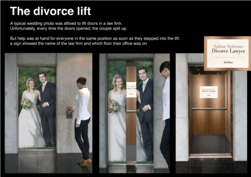
Sabina Stobrawe: Divorce Elevator
What’s Great About It: The concept…and that’s about it.
Where it Falls Flat: The elevator doors always have to shut—meaning the couple will always end up “back together.” Not the best message for a divorce lawyer!
How We’d Improve It: Don’t make the bride and groom happy. If their faces were unhappy or even neutral, the message remains the same and isn’t negated half the time. Plus, it might be even more attention-grabbing than if they were happy. We’d also make the sign with the lawyer’s information much larger and include copy to reinforce the imagery. If people are too distracted (or not interested enough) to glance at the tiny ad, they may not put the pieces together about the marriage scene they just walked into. (That’s another reason the couple shouldn’t look happy—passerby may think it’s an ad for a wedding service!)
Esteban Gergely: Our Honeymoon
What’s Great About It: This is a very creative idea with a fantastic “aha” moment.
Where it Falls Flat: Viewers might click away on instinct when they see “this video has been removed.”
How We’d Improve It: We’re not sure that this is a case of “what to improve” rather than “how would this work?” How would people get to this video? Why would they click on it? It’s part of a series of similar videos—does having multiple versions of this ad reinforce the messaging, or is it just trying to show off how clever it is?
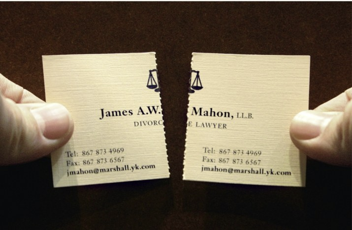
James Mahon: Tearable Business Card

What’s Great About It: This creative concept blends interactive advertising with quirky product design.
Where it Falls Flat: Unfortunately, the concept—as fun as it is—falls apart when you start to think about it. Who would you give the other half to? Surely not the spouse you’re divorcing; the same lawyer can’t represent each party. Perhaps it’s a race to see which spouse calls Mr. Mahon first. Or maybe you’re supposed to give the other half of the card to your affair partner so they can also divorce their spouse.
How We’d Improve It: Since the card itself isn’t very practical, maybe it could be a gag in a TV spot. That way you can explain the intent (who is it for?) and give the joke more payoff. The imagery might make for a snazzy magazine ad, too.
J. Michael Gallagher: Take My Wife Please
What’s Great About It: The idea of an ad within in ad is interesting, and the “Don’t Be A Weekend Parent” URL is phenomenal in terms of memorability and attention-grabbing.
Where it Falls Flat: Because of its age, this ad feels a little dated…but to be honest, that’s the source of a lot of its charm: the cheap, public-access-TV vibe makes it feel authentic. No slick lawyer-talk here!
How We’d Improve It: We wouldn’t. 10 out of 10.
J. Michael Gallagher: Big Night Out
What’s Great About It: It’s from the same lawyer as above, so it still has the fantastic “Don’t Be A Weekend Parent” URL.
Where it Falls Flat: It’s slow and not quite clear, and it doesn’t have much of a satisfying payoff or “aha” moment.
How We’d Improve It: Speed it up, take out the clichés (like the “priceless” format…come on), and make it feel more like real life. The scorned wife with the rolling pin and the field frolicking scenes risk making a mockery of the concept of divorce. Gallagher’s last ad was just silly enough to not take itself too seriously, but here, the over-the-top goofiness in every scene sends the ad into “cringeworthy” territory.
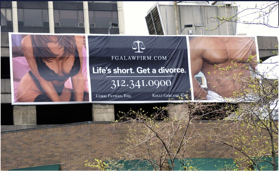
FGA Law Firm: Life is Short

What’s Great About It: Say what you will, but it certainly grabs attention!
Where it Falls Flat: This billboard was removed after public outcry. While you could take the “no such thing as bad publicity” stance, in our eyes, it’s never a good thing to have an ad removed—especially one this expensive.
How We’d Improve It: Simple—make this an online display ad instead. And make the law firm’s name bigger.
Happy Valentine’s Day from Kirkpatrick Creative!
If you’re not feeling the love with your law firm’s advertising, contact Kirkpatrick Creative today. We’d hate to see your firm on one of these lists in the future!

