Running a digital advertising campaign? Landing pages are the key to targeting audiences, gathering valuable data, and getting more conversions. Find out all the ways landing pages can benefit your campaign.
What is a landing page?
A landing page is where users “land” after clicking an ad. The landing page is where they can learn more about your offer and, ideally, convert—that is, take the action your campaign is centered around (buy or download something, register for an event, schedule an appointment, etc).
Unlike all the other pages on your website, landing pages are specifically designed to either:
- Get the prospect to convert right at this moment, or
- Capture information about the prospect so you can nurture them into converting at a later time.
Why are landing pages useful?
There are several benefits to landing pages, and most of them boil down to the fact that they are extremely effective at narrowing the sales funnel down to its final point.
Here are 3 of the most important reasons why your digital advertising campaign needs to use landing pages to optimize conversions:
Reason #1: Save Money on Your Campaigns
How do landing pages save you money? It’s simple: if you’re paying for clicks, those clicks need to be worth something. With landing pages, the clicks you get are more valuable.
By creating offers and landing pages for specifically-targeted customers, you’re advertising directly to the most qualified candidates—and not wasting a cent on anyone else. When it comes to conversions, digital advertising is a much smarter media buy than attempting to advertise to every person in an area (like TV) or paying for ads people might not even notice (like print).
Even if a prospect doesn’t end up converting, they’ve still likely given you valuable data that you can use to further refine your digital advertising strategy. For example, if you find that lots of people are clicking on an ad but very few are converting, that tells you that something on your landing page is turning them away. Is it your messaging? Your layout? What about your call to action? A/B testing will be able to tell you more.
Reason #2: Get Straight to the Point
Landing pages save your customers the trouble of hunting down what they want from you (which is especially important when they’ve clicked on an ad promising them something). By eliminating the friction that can occur between clicking on an ad and converting, you make it that much easier for them to do so.
Because landing pages are so specific and intentional, the customer typically takes one of two routes: they will either convert or hit the back button. In other words, landing pages are not where people come to browse and learn about your company’s values. Which leads us to Reason #3…
Reason #3: No Distractions
A well-designed landing page will limit the navigation available to the user. You won’t see lots of links to other pages like you would on a homepage. Instead, since the only goal is to make a customer convert, navigation is reduced, hidden, or even deleted. The idea is to minimize distractions so that people will convert instead of going somewhere else on your website.
In the same vein, you don’t want to put more than one call to action (CTA) on each landing page. “Research shows that the more choices you give people, the longer they take to make a decision—and the less motivated they are to do so,” explains Rachel Burns of ActiveCampaign. “Too many options makes people more likely to click the back button than your CTA.”
Reason #4: Segment Audiences & Target Who You Want
Just as digital advertising allows you to target specific audiences, the same goes for landing pages. (That’s exactly why they go hand-in-hand!) Unlike your homepage, which is designed to appeal to as many prospects as possible, landing pages are best used as places where a very specific audience is encouraged to take a very specific action.
This is especially useful if you want to experiment to see what types of gated content (ebooks, webinars, etc.) gets your segmented audiences to click and convert. It empowers you to further customize your campaigns, which can reduce your cost per click, improve your return on investment, and provide even more valuable information about your target demographic.
Common Landing Page Mistakes
Just because you send prospects to a landing page doesn’t mean you should cram as much as you can there in an effort to squeeze out a conversion. Here are a couple of common mistakes people make when they’re starting out with landing pages:
Mistake #1: Bombarding the User with Irrelevant Info
The last thing you want to do is draw a prospect in with one message and then serve up a completely different message on the landing page. That’s one of the quickest ways to create doubt and give them a reason to hit the back button.
It’s also not a good idea to write long-winded copy on your landing pages, even if it’s relevant to what you’re advertising. Doing so increases the chances that users will have to scroll to find your CTA. In other words, you need to make it as simple as possible for prospects to take the desired action.
“Your future customers are clicking for a reason, and duping them by not giving them what you’ve promised is not going to form a good first impression,” says Cheryl Baldwin of WSI. “Now is not the time to give a detailed history of your company.”
Mistake #2: Asking Users for Too Much
While the point of a lead-generating landing page is to collect information from interested prospects, they’ll quickly lose interest if you’re too demanding. For example, asking for a phone number and email is understandable—you need to be able to contact them, after all—but asking for a home or work address is where many people draw the line. Request only what you need and they’ll be more likely to complete and submit your form.
However, this doesn’t mean you should ask for the bare minimum if it won’t help you! Lead-generation forms are great ways to gather data on the people your ad has attracted. You’ll need to find the perfect balance between getting enough information to benefit your campaign and limiting the amount of work prospects will have to do.
“If you simply can’t shorten your form, break it into steps, and let the user see exactly where they are in the process,” Baldwin suggests. “For example, listing their name and address may be step one of four.”
What Makes A Landing Page Effective?
So what exactly does your landing page need in order to get those coveted conversions? We’re glad you asked!
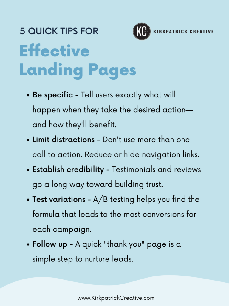
Here’s a FREE infographic outlining 5 quick tips for effective landing pages:
Keep these tips in mind when creating your digital campaigns and you’ll find out just how effective landing pages can be for increasing conversions.
Boost Your Digital Advertising Conversions with Landing Pages
Stop throwing away the leads you’re paying for. At Kirkpatrick Creative, we’re dedicated to creating advertising that’s engineered to work—and that includes streamlined, efficient digital strategies that pay off in qualified leads.
Ready to start creating landing pages that are designed to convert? You’re in the right place. Contact Kirkpatrick Creative today to schedule a discussion about your digital needs.
Featured image by Visual Design on Unsplash


